GetNinjas

About the company
GetNinjas is an app that connects clients and professionals, headquartered in São Paulo, managing the largest online platform in the country for connecting clients with service providers. The app offers services in more than 500 categories, ranging from domestic services and repairs to photographers and designers. Founded in 2011 by entrepreneur Eduardo Orlando L’Hotellier, the startup has raised over R$ 47 million in investments from companies like Monashees Capital, Kaszek Ventures, and Tiger Global. It has apps for both iOS and Android, with separate versions for clients (who request services) and professionals (who provide the services). I worked for GetNinjas between 2020 and 2021, with most of my time dedicated to the professional app.
1.Step-by-step
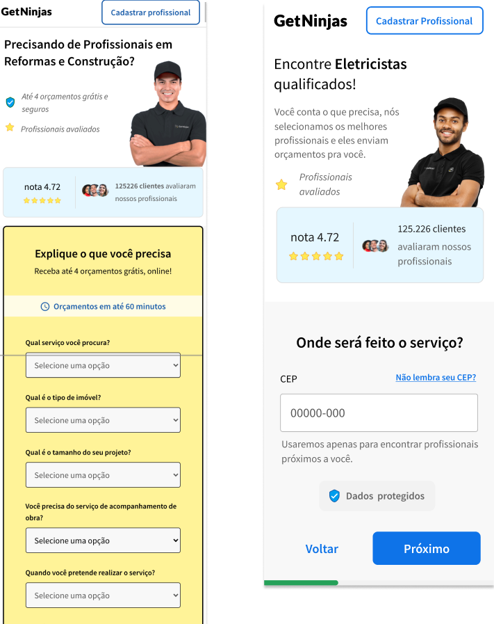
The Challenge
With the update of the registration form in the Step-by-Step system, a significant increase in the abandonment rate was observed. In light of this, an investigation process was initiated to identify the causes of this increase and propose improvements to the project. The goal was to optimize the user experience and ensure a smooth transition during the registration process.
My Role
My role as a Product Designer was to identify the causes of the decline in conversions during the updates, while simultaneously developing a new interface that revitalized the aesthetics without compromising conversion rates.
Design Process
For the version 3 implementation of the Step-by-Step in the customer flow, new studies were conducted to improve the current screens, focusing on reducing the abandonment rate in the registration flow, especially when customers reach the personal information step.
Data from Previous Stages:
The information from what had already been developed previously for the Step-by-Step process was gathered. This helped to understand the existing structure and identify areas for improvement, ensuring a more streamlined and effective user experience moving forward.
Survey nas URL
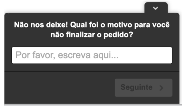
Survey Included via Hotjar to Identify Reasons for Abandonment: A survey was implemented through Hotjar to gather insights into the reasons why users were abandoning the form. The survey aimed to collect direct feedback from users, helping to identify pain points and areas for improvement in the form submission process.
Analysis and Monitoring of Recordings: Through Hotjar, recordings of user accesses and attempts to submit requests were analyzed. This allowed us to observe user behavior, identify potential friction points, and understand where users were dropping off or struggling during the form submission process.
Toolkit


Success Metrics
- Reduction in Abandonment Rate: Decreasing the number of users who leave the form without completing their request.
- Improvement of Existing Screens: Enhancing the usability and design of the current screens to make the process clearer, more intuitive, and more engaging for users.
Research
On February 24, 2021, a simplified survey was created through the Hotjar platform to collect information about V2, alongside the analysis of videos also gathered from V2.
The survey was online for a period of 7 days, obtaining a total of 120 responses. Among the responses, some stood out as particularly relevant for understanding why people abandoned the form without completing the request:
Results
Not wanting to enter the ZIP code and phone number: One of the people who abandoned the form reported that they did not want to provide the ZIP code and phone number.
Not understanding how GetNinjas works: Some users were unclear on how the GetNinjas platform operates.
I’m just checking the price: Many users were only interested in seeing the price, not engaging further with the service.
Form filling issues: Users encountered problems when trying to complete the form, which led to abandonment.


Recordings
To generate insights into the possible causes of form abandonment and areas for improvement, recordings from the Hotjar platform were also reviewed.
The videos were filtered based on the URLs mentioned earlier, focusing on those with the highest number of drop-offs.
Total: 112 recordings watched
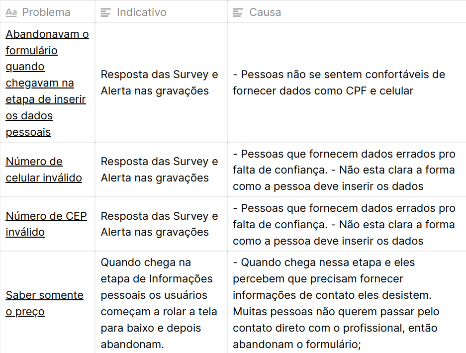
Main Issues
- People who abandoned the form when they reached the stage of entering personal data, especially CPF and phone number.
- Invalid phone number.
- Invalid ZIP code.
- When reaching the personal information stage, users begin scrolling down the page and then abandon the form.
Hypotheses
- People are uncomfortable providing data such as CPF (taxpayer identification) and phone numbers.
- People provide incorrect data due to a lack of trust.
- Many people just want to know the price without necessarily speaking with a professional; when they realize the level of commitment required, they abandon the form.
- The fact that users start scrolling when they reach the information screen could be a result of many users simply wanting to know the service price.
Solution
The issue of drop-offs is not directly related to usability or interface problems, but rather to the users’ intent, in this case, merely browsing the prices. A possible solution would be to redirect the user to the pricing page.
Adjustments
- Bug fixes and monitoring of false zip code and phone number entries
- Generation of ideas to modify the interface with the goal of instilling greater trust in the user

2.Home/Advertise
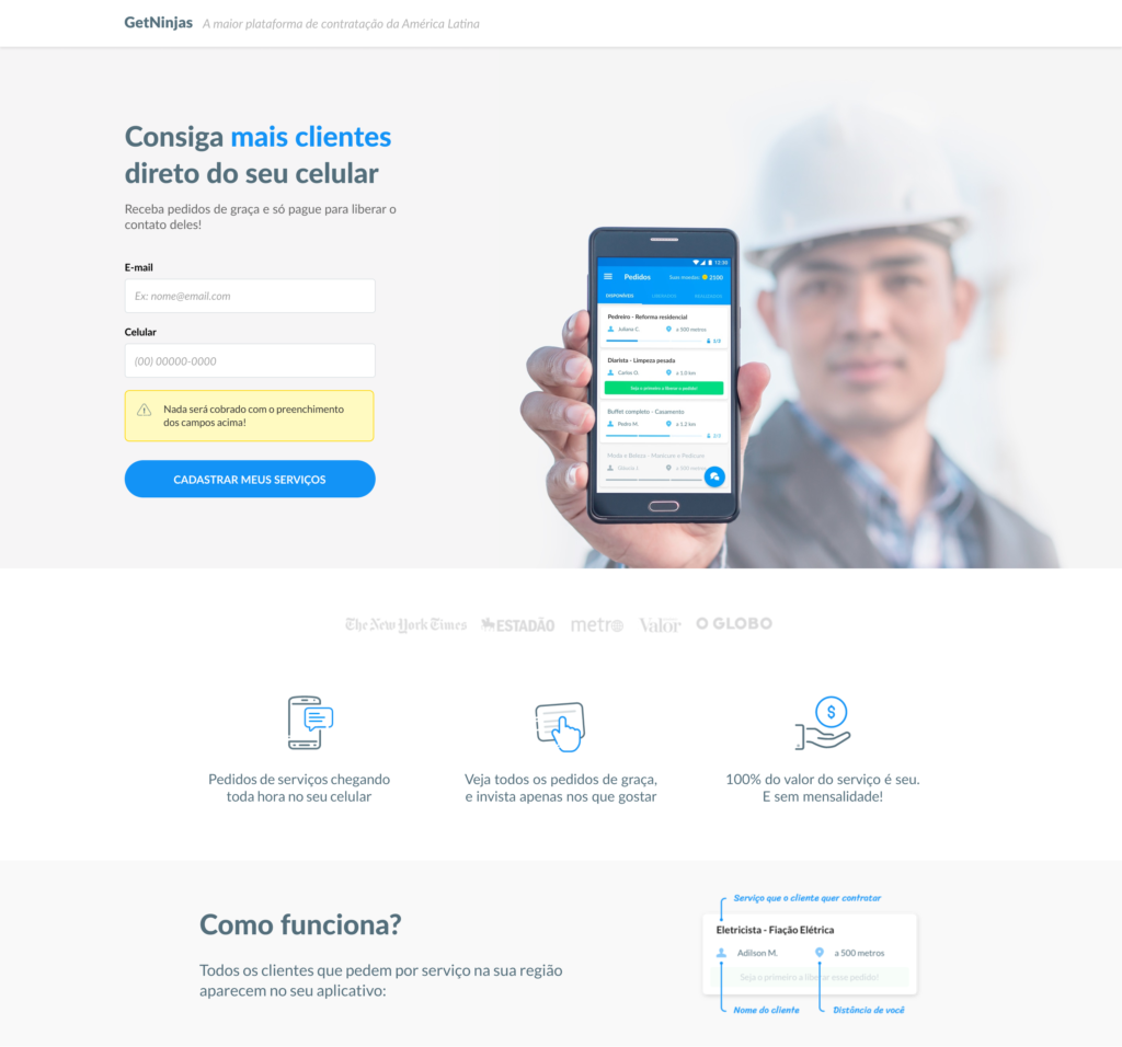

The Challenge
The conversion landing page aimed at new professional users/service providers had a significant gap in relation to the visual identity of the GetNinjas brand. Any modification to the interface resulted in a decrease in conversion rates.
My Role
My role as a Product Designer was to identify the causes behind the conversion drop during updates while simultaneously developing a new interface that revitalized the aesthetics without compromising conversion rates.
Success Metrics
- Implement best UI practices according to the GoodUI platform.
- Maintain or improve the conversion rate of professionals.
Redesign of a new version of the home/advertise page. Several versions had already been created without success until the current version, which achieved a 6% increase in conversion
Toolkit


Design Process
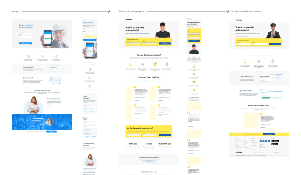
Complete Home Page
The initial phase of the project began with a comprehensive approach, focusing on a complete overhaul of the page’s visual identity. However, without UX guidance, this first version resulted in a significant 17% decrease in the conversion rate for new professionals. This initial feedback highlights the importance of incorporating user experience (UX) practices to optimize future iterations and improve project outcomes.
GoodUI Study + Consulting
In light of the significant reduction in the conversion rate, which directly impacted the company’s revenue generation, I initiated a thorough investigation to understand the reasons behind this decline. My first strategy involved using available tools, such as exploring studies on the GoodUI platform, to identify patterns present on the affected page.
After identifying some hypotheses (see images below), we sought a proactive solution and requested consulting from the GoodUI platform team. The guidance received was to conduct an A/B test, comparing the old version with a specific modification, in order to validate the raised hypotheses and find effective solutions to reverse the decline in the conversion rate. This process exemplifies our commitment to seeking insights and implementing improvements based on data and best practices recognized in the UX/UI field.
Hypotheses
Below are some of the hypotheses raised:

Good UI
On the GoodUI platform, performance test results related to updates or modifications on various websites are provided. The team offers consulting services, conducting weekly meetings to present the results obtained and discuss the evolution of the interfaces.

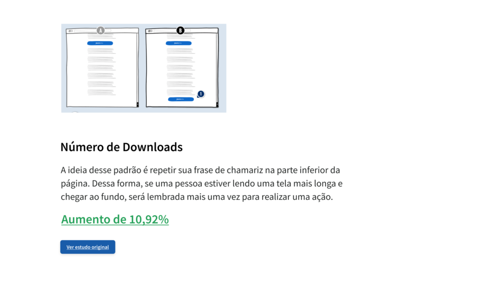

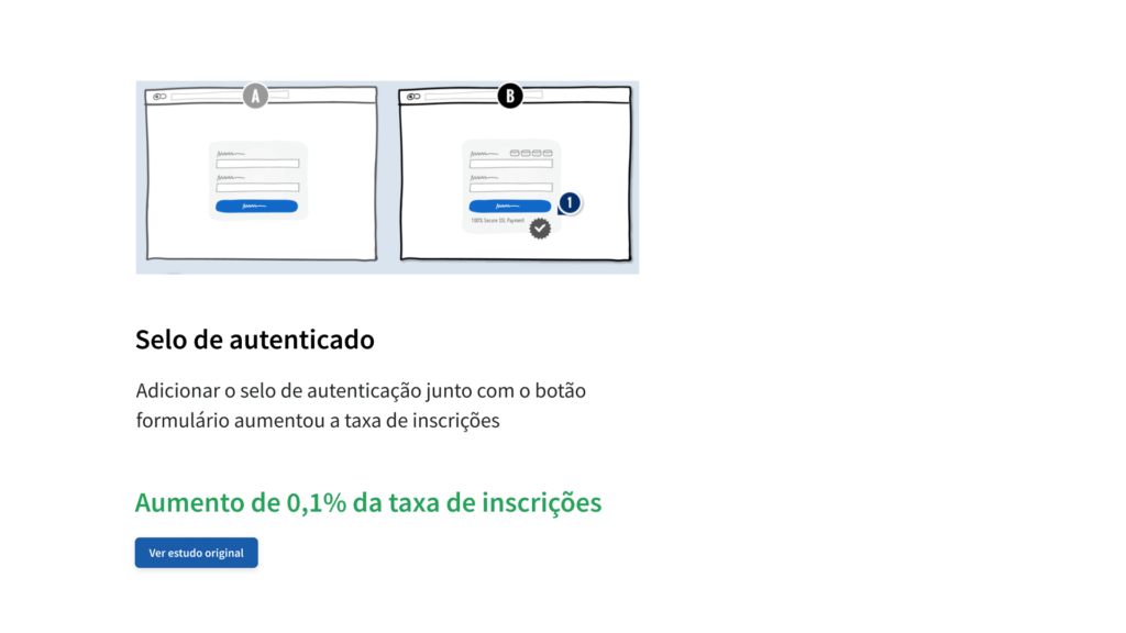
Server Change
After the consultations, we also considered the possibility of technical issues. We replaced the server and conducted an A/B comparative test between the old version and the fully updated version. Surprisingly, the old version persisted, showing a higher conversion rate in this test.
This process highlights the complexity involved in identifying and solving problems, emphasizing the importance of holistic approaches to ensure the effectiveness of updates and modifications in digital projects. We are committed to exploring all aspects to optimize the user experience and, consequently, drive the company’s performance and revenue.
Solution
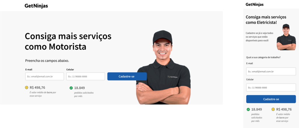
From this point, we conducted the final test, making modifications only to the header of the page as directed. In this step, we created two versions of the header: one displaying only the number of daily requests in the chosen category for testing (private drivers), and the other showing both the number of requests and the average profit of the category.
Additionally, we updated the colors, icons, and typography throughout the rest of the page, without modifying any elements or information. These changes aimed to assess how different elements in the header impact the user experience and conversion rate. By conducting this final test, we sought to find the most effective configuration that optimizes not only usability but also the company’s financial results.
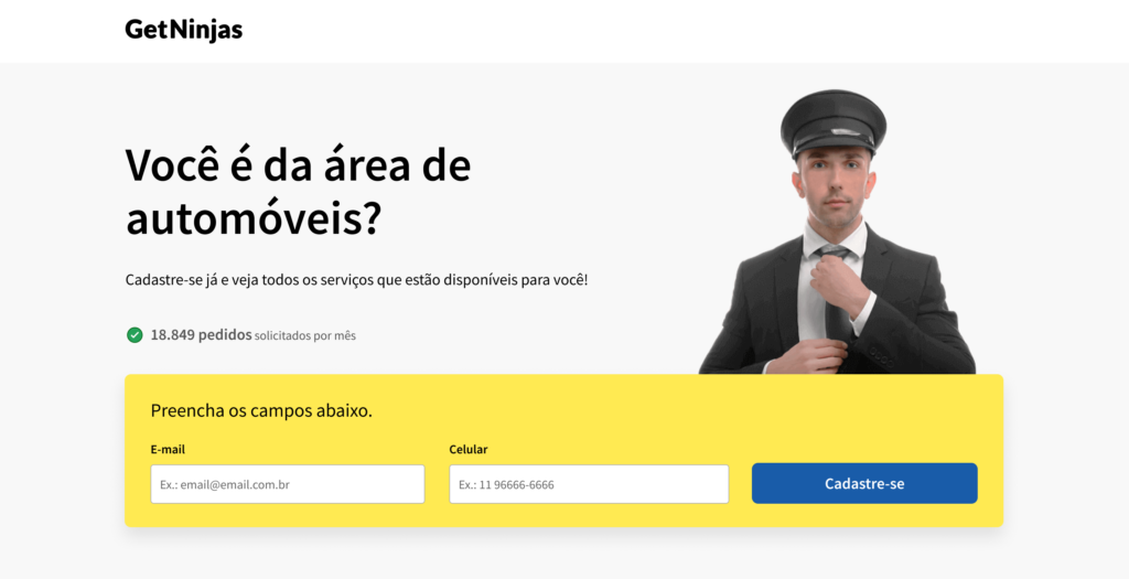
Result
As a final result, we observed a 5% increase in the version that displayed both the number of requests and the average profit of the category. Surprisingly, the variation showing only the number of requests recorded an even more significant increase, reaching 18%. We chose to gradually implement this last version across the other categories.
These results indicate the effectiveness of the approach focused on the number of requests to improve the conversion rate. The gradual implementation across the remaining categories aims to consolidate these gains and provide an enhanced experience throughout the platform.

