The work described here presents the app proposal submitted for the completion of Module I of the UI/UX Design specialization course offered by theCalifornia Institut of Arts (CALARTs).
Course Objective
This first module of the course aimed to provide an introduction to the main processes and studies on Interface design. The project proposal was to design an application, step-by-step, throughout the classes according to one of four themes: Cardiac monitoring, Digital Microscope, Instrument Tuner, and Food/Restaurant Finder. I chose the cardiac monitoring theme.
Contents
Add a header to begin generating the table of contents
For my final project, I adapted the theme ‘Cardiac Monitoring’ to ‘Cardiac Monitoring for News Readers’. Considering the current global scenario and the freedom provided by the briefing, I opted for this more ‘playful’ proposal.
The application presented here is a study of Interface exclusively; therefore, there are features that may not be suitable from a UX perspective.
Design Process
Project Stages
The project was divided into the following stages:
Theme selection;
Moodboard of references;
Logo design;
Simple Design Patterns;
Sketch of the Home and another screen.
Moodboard
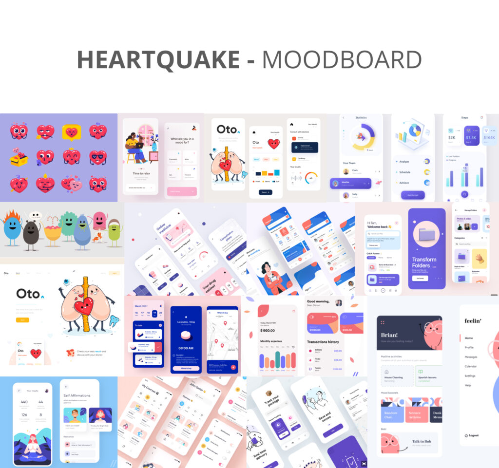
The first practical activity was the creation of a moodboard with between 15 and 20 images that would serve as inspiration for the final project. Since the exercise did not include conducting a competitor analysis, I chose to blend the moodboard proposal with benchmarking, directly seeking ideas from applications that would serve as visual references for the project.
Typography Guide
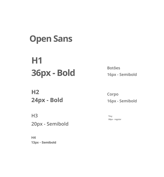
The Open Sans typeface was chosen for the project. As instructed during the course, the chosen typography should prioritize the construction of an image that will captivate the user. The selected typeface is sans-serif, which enhances readability dynamics, something desirable in an application.
Colors Guide
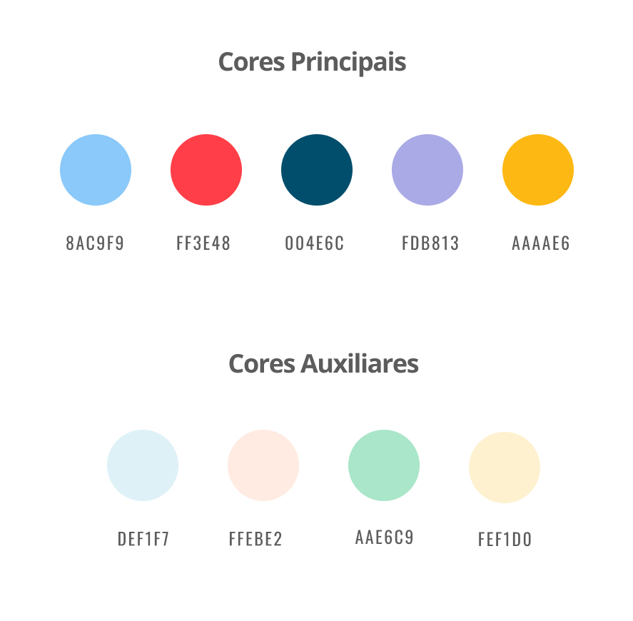
Since the project proposal aimed to be more fun, the palette includes colors like purple and yellow, while still following the colors suggested by the moodboard.
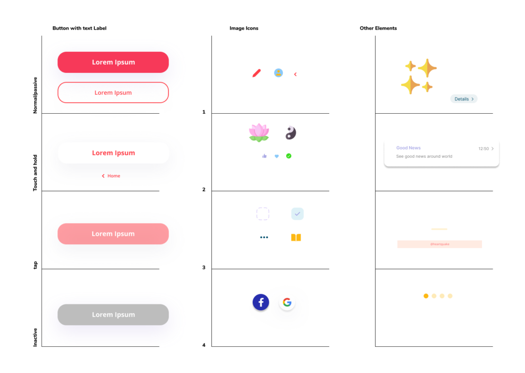
Design Pattern
Before beginning the screen designs, I created a pattern of main elements to be followed throughout the project. As is customary, several other elements were added later on, but always adhering to the initial pattern as an example.
Illustrations
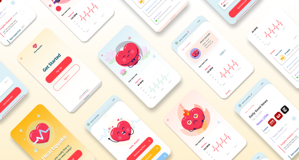
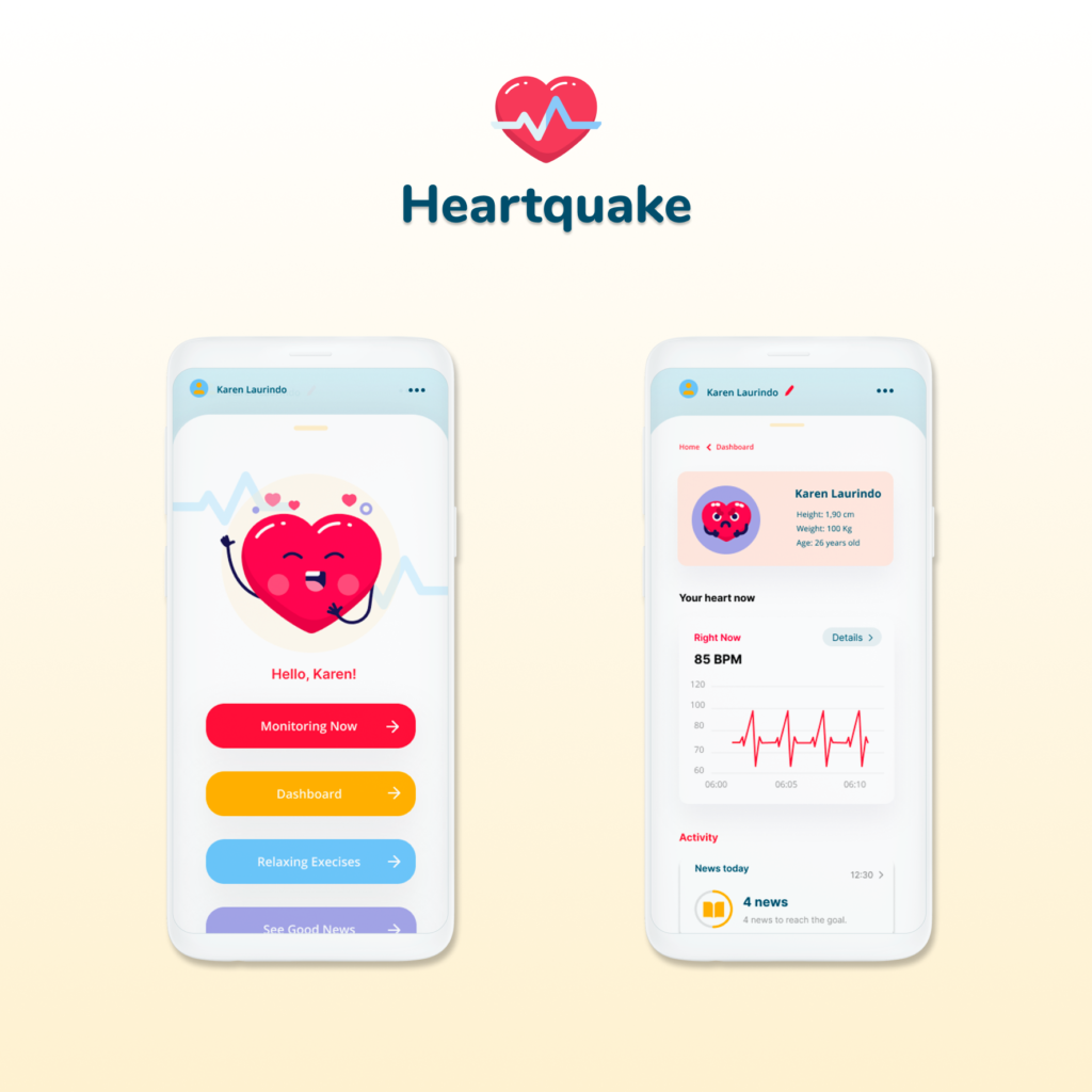
Based on the idea of cardiac monitoring and fun, I created the character Core, which reflects the user’s emotional state based on their heart rate.
The idea was to personify the conventional image of a heart, always accompanied by auxiliary elements in the background and with new facial expressions.
Initially, in the prototype, the illustrations are static, but in a real application, these illustrations would be animated and accompanied by sounds.
The idea of having a character helps create attachment to the application from the user’s perspective, a method widely used in gamified applications. The intention here is not to create a game but simply to captivate the user.
Final Project
For the final project, the two main screens were requested: the homepage and a dashboard. I followed all the guidelines given during the course regarding composition, the grid for applications, and spacing in multiples of 8px.
Final Prototype
Alongside the screens requested by the exercise, I created some screens that make up the basic flow of the application. Feel free to test it using the button below.
It’s ideal to test the prototype on a mobile device, but it also works fine in a web simulation.
O ideal é testar o protótipo em um aparelho celular, mas este funciona sem problemas em uma simulação web.