
The Coin emerges as an innovative tool in the financial education landscape, developed as part of a final project at FAU-USP. With a design-driven approach, it seeks to simplify financial concepts for all audiences.
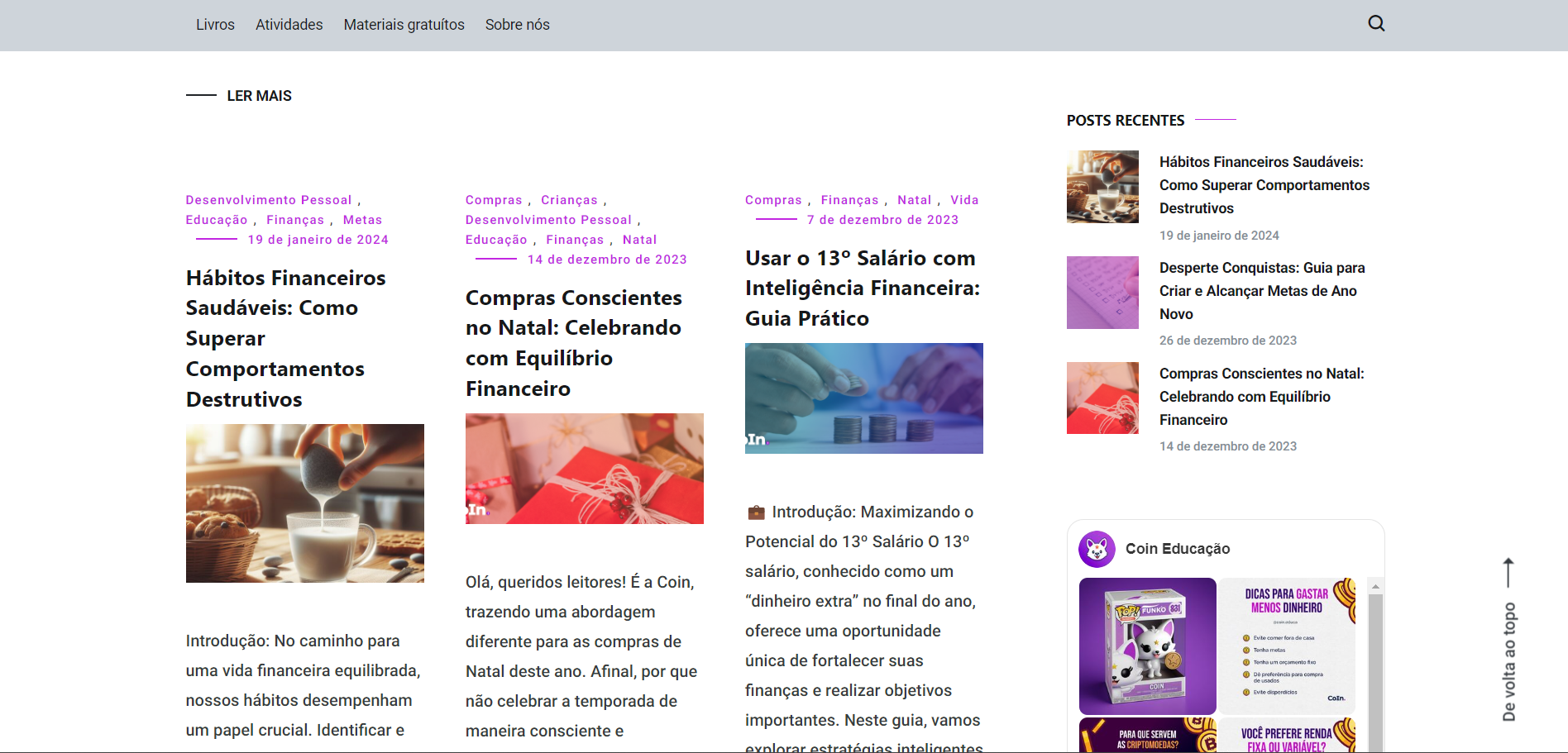
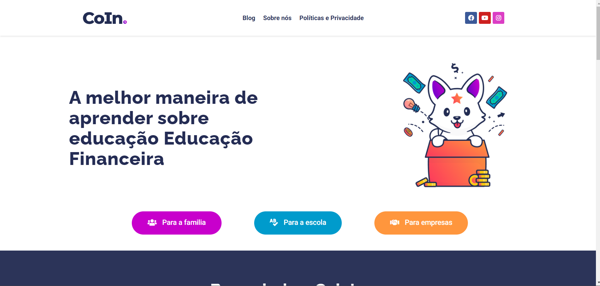
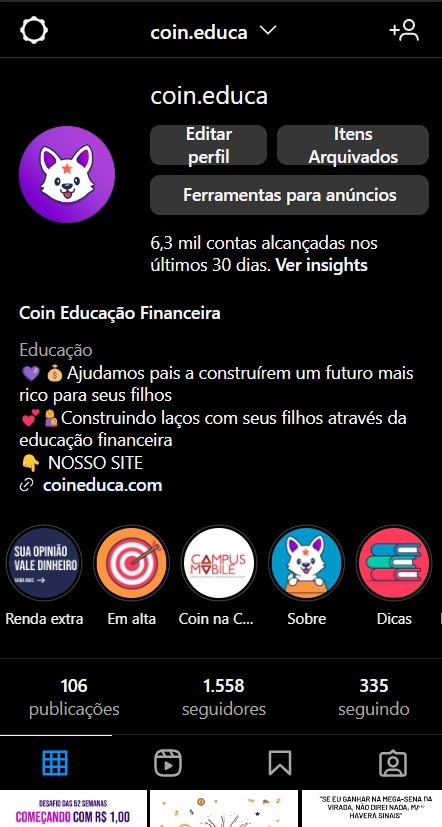
In the app, the experience is guided by visually appealing aesthetics, providing an environment conducive to understanding essential financial principles. The blog and social media channels are filled with tips, games, and stories, integrating financial education in an engaging manner.
Learn more at the link below and join this journey of exploring the fascinating world of finance, with Coin as an impartial guide, offering a unique blend of aesthetics and financial learning.
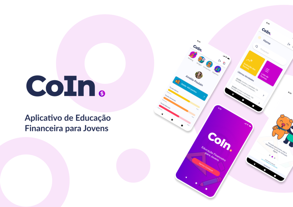
Given the reality faced by many Brazilians, the core of my undergraduate thesis consisted of developing a high-fidelity prototype for a financial education application aimed at youths aged 11 to 14. This was based on research conducted during the Course Conclusion Work 1.
After completing the Product Design phase, I decided to continue the project independently, marking the beginning of the creation of the CoIn Financial Education Startup. The venture is duly registered, being an integral part of the CNPJ of my company, KenazLab.
In the CoIn project, I played a central role as the Product Design lead, overseeing all phases from conception to implementation. With an individual approach, I developed the entire thesis, ensuring that each element was meticulously planned to meet rigorous academic standards.
The discovery and initial delivery process, which led up to the high-fidelity prototype, was divided into two major phases, each lasting 6 months. The phases and their stages were as follows:
We will present here in this portfolio only a summary of the main points, considering that the original monograph contains 240 pages of project description
As the project methodology, the Double Diamond approach was chosen. This method was created in 2005 by the British Design Council in the United Kingdom. The Double Diamond involves exploring a problem or improvement opportunity broadly, then focusing on targeted actions.
In practice, it is a Design Thinking methodology. It’s a process aimed at delivering a possible solution to the end user that truly fits their needs.
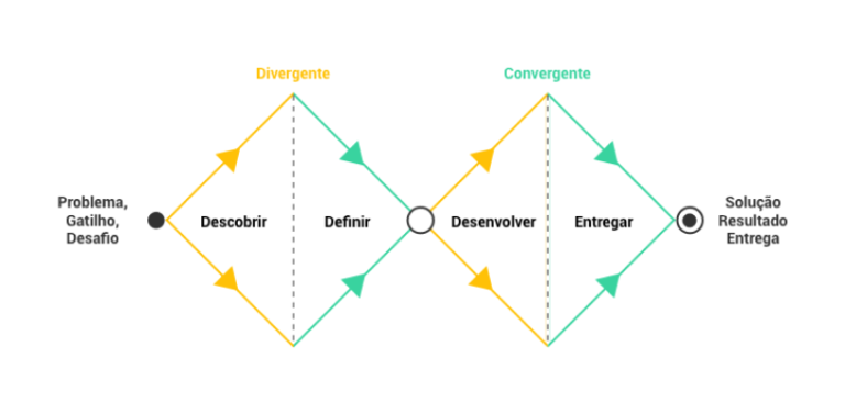
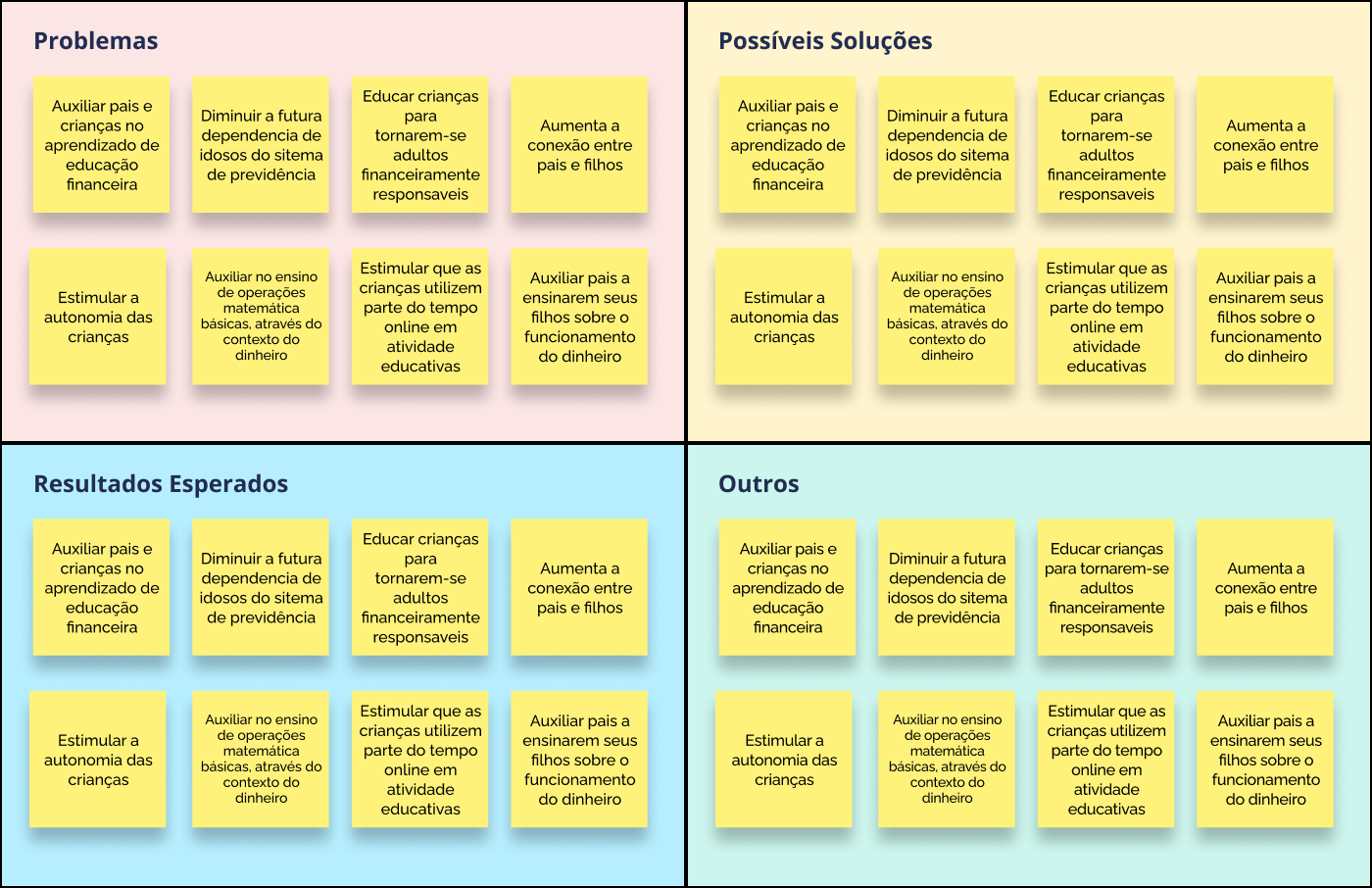
The data collected from qualitative and quantitative research were grouped and analyzed, along with opinions, information, and issues. With these groups formed, action points against the main problem are established
In this initial project, we will focus on parents who already show interest in participating and acquiring an educational project focused on financial education. In the case of parents who do not express interest, it would require an engagement process and separate product planning. Since this is not the focus of the current project, we will not consider these parents as potential users. The parents chosen as the focus group were divided into two types for the creation of personas: Conscious Parents and Moderate Parents.


The chosen age range for the focus comprises children aged 10 to 12 years old, characterized by reading and writing skills, active interaction with games and apps, emerging independence from parents, ability to make choices, and interaction with tailored content. This group is at the beginning of the financial independence process, starting to use money autonomously, choosing and consuming products aligned with their individual preferences. Children have been categorized into distinct profiles, including Saver Child, Moderate Child, and Spender Child, reflecting their different approaches to money.


• Understands how money works, but it’s not a primary concern. They also have a piggy bank, but save for a while only to spend it all or most of it at the first opportunity.

• They have no interest in learning about money, whether they receive an allowance or not, they always spend everything at the first opportunity they find.
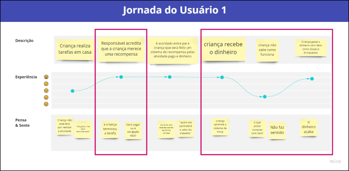
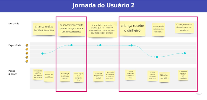
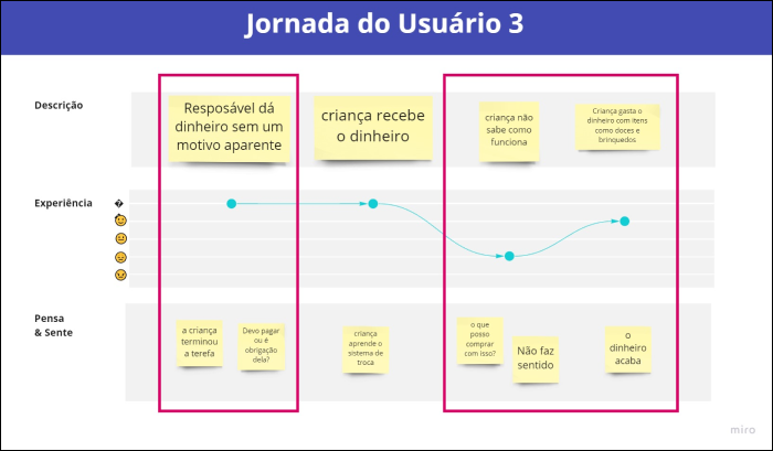
A user journey map tells the story of their experience from the initial contact with the product. However, since we are creating a product from scratch, the user journey evaluated here observes how the family’s relationship with money works today, from how the child obtains this value to the moment they give it a purpose. This exercise aimed to identify fundamental interactions that the user had with money at possible points of action for our product. According to Martin & Hannington (2012), the positive, negative, and neutral moments in the interaction with a multi-channel product or service over a period of time.
Three main journeys were defined, and in them, the project’s areas of action were identified (in red), meaning where in the journey the project will enter as a problem solver.
Foram definidos 3 jornadas principais e nelas identificados (em vermelhos) as áreas de atuação do projeto, ou seja, em que parte da jornada o projeto entrará como um solucionador dos problemas.

The Tindin app is an excellent financial education application. The platform can be used by four potential users: Parents, children, teachers, and merchants.

“It functions like a calculator where the only operations are addition and subtraction. When opened, there is a single sound effect that says ‘add the value.’ This feature did not appear again during the analysis.

The Portuguese app is extremely simple, where parents add or subtract money from their children. The child has a statement system, which deducts money from the system as they spend their allowance. The app features a mascot, making it more appealing to children.
Based on all the information gathered in this report and mainly drawing from the readings of D’aquino (2008) and Cerbasi (2011), the final strategy for the project has been established.
The method focuses on raising awareness among parents about the importance of teaching specific financial skills at each stage of childhood. For children aged 2 to 10, basic competencies are developed, including financial understanding, budget limits, moderate independence, and basic mathematical notions.
Pre-adolescents receive emphasis on promoting independence and financial responsibility, introducing allowances as incentives. The method maintains a non-childish approach, encourages saving, and sets future planning goals.
Rewards are tied to significant achievements, valuing the present over monetary value. Principles include the appreciation of achievements, selective celebration, budget awareness, and the development of negotiation skills and financial balance.
Additionally, the method proposes the adoption of daily habits, learning through fun, positive examples, teaching with care, organization, discipline, conscious shopping, patience, and not considering children as investments. Piggy banks are encouraged as a positive practice.

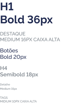
For the application logo, simplicity and contrast between the elements were sought. The logo bears the name of the application using typography alone. The Montserrat typeface was adopted because the official typeface of the application did not distinguish between uppercase I and lowercase L. The detail of the $ inside the circle was added as an allusion to a coin.

The choice of colors for the Design System was based on trend research and relevant content for the young/pre-adolescent audience, considering accessibility and contrast to highlight key elements. Accessibility tests were conducted using the Contrast plugin in Figma, focusing on visual difficulties such as color blindness during the development of the Design System.
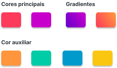
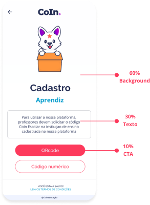
The Design System adopts a color prioritization pattern based on the importance of elements on the screen. The distribution follows an approximate estimate, allocating 60% for less important elements (background), 30% for intermediate elements (secondary color), and 10% for more important elements (primary color).Referencia
Both the visual identity of the project and the choice of colors followed the trend of current applications. The chosen colors followed much more the trend of colors of “modern” websites and applications geared towards the public than the color standards of competing applications. In the later stages of the project, criteria such as colors and emphasis on CTAs will be tested in the project. Pinterest and Dribbble were used to create the reference panel.
Just as interactions were recommended by Material Design, there are fonts considered more appropriate for application in apps, specifically Android. In Material Design specifically, the use of the Roboto font is recommended. However, the Raleway and Open Sans fonts were chosen for application in the project due to some of their characteristics:
They are free: The fonts are available for free on Google Fonts.
Legibility: The fonts can be reduced and still remain legible. Here, the application proved to be readable in tests down to the size of 9 pixels (using the mobile screen for visualization). Beyond this, readability becomes more challenging as identified in perception tests.
Variety of styles and accentuation: The Open Sans font has 10 styles, while Raleway has 18 different styles, including regular, semi-bold, bold, and italic, as well as Latin characters with accents that are necessary for an application in the Portuguese language.
Throughout the navigation of the application, we encounter various illustrations, all of which refer to animals and elements common to school and money environments. The chosen animals refer to culturally symbolic animals of money and good luck. All illustrations were taken from the freepik website and adapted according to the project’s needs. The animals used in the project are:
Water Dog: Belonging to Brazilian folklore, according to popular tradition, it appears on the banks of the São Francisco River, drying its white fur in the sun, and can be recognized by a star on its forehead; for those who see it, it symbolizes life changes, luck, and happiness.
Panda: Symbol of Chinese culture, the panda is considered a symbol of determination and persistence. They have a solitary nature, which leads them to be identified with the representation of independence.
Pig: There are several theories as to why pigs symbolize abundance and money, especially why many piggy banks have this shape. Here we will consider Chinese culture as a reference, where the pig is known to be a symbol of abundance, so following this belief, they created a clay piggy bank to bring wealth and prosperity to Chinese homes.
Calico Cat: Also known as calicos, they are known as symbols of good luck in some cultures. In 1870, the Japanese declared that tricolor cats were an official symbol of fortune in Japan and the country’s lucky cat. The maneki-neko, the Asian sculpture of the lucky cat with the raised paw, is commonly described as a tricolor cat. In addition to the animal illustrations, some auxiliary illustrations were made. The complete list of illustrations can be found in the elements library.

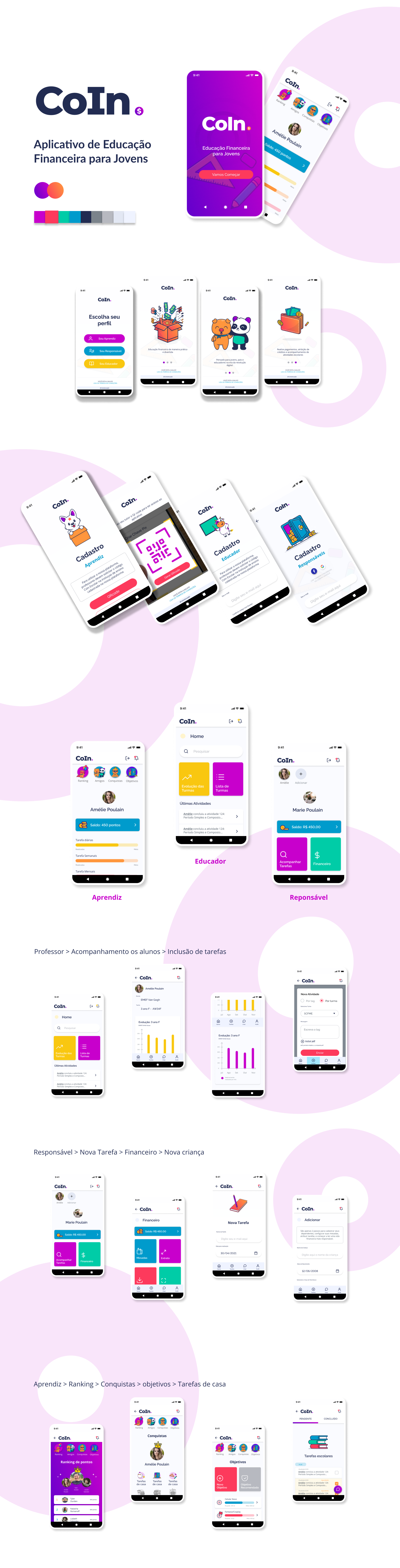
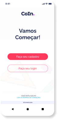
For a better understanding of the application, getting as close as possible to what would be a real application, a high-fidelity prototype was created.
In addition, the main interactions were simulated, with variations of colors in buttons and screen transitions to make the prototype as close as possible to the real application.
The prototype was also used to conduct usability and perception tests.
The development project will be documented in my specific portfolio at Kenaz Lab. You can find more details at the link below:
Simultaneously with the progress in the application development, I am dedicating efforts to creating a compelling website, an engaging blog, and constantly updating social media channels. These initiatives aim not only to promote but also to maximize the profitability of the project by creating a robust and engaging online presence.